Multi-device Syncing Strategy

While reconstructing my app (WordsBaking), a big challenge is data synchronizing. I’ve spent a lot of time thinking about possible ways, and still not sure if I got the best one.

There are two main problems I am facing.

Physical timestamps can’t be trusted

When the user is online, well we may actually calculate the timestamp based on the difference between client and server that can be somehow trusted at some degree. However the process could be really complex if we want to get every detail right. And if the user is offline, you can never tell the timestamp that can be trusted.

So I have to get rid of it, and choose only to trust the physical timestamps with limited correction (lower and upper bounds).

There are too many records to compare when syncing

For my app, there could be thousands of records. And I can’t just upload all of them every time to check whether their timestamps are smaller than the copies on the server. Another independent timestamp for syncing has to be set for quickly picking up records that might have newer version.

The solution seems to be really obvious, just add another timestamp for sync seeking. The question keeps around in my mind is, do both of the timestamp for seeking and for version comparing necessary?

If they are, the complete synchronizing logic would be:

Client

clientStamp: updated every time after syncing, and the value equals the server time when that syncing happens.
itemUpdateStamp: updated every time when an item gets created/updated/removed, and the value should be greater than the latest clientStamp.

When syncing, client would upload the clientStamp and changed items along with their own itemUpdateStamps. And then it would receive changed items from the server along with the new clientStamp, it won’t receive new itemUpdateStamps because it’s not the device that would compare the records version.

Server

For every record in the database, it will have both the clientStamp and the itemUpdateStamp. When receiving a syncing request, it will first find all the records that have the clientStamp greater than the value it receives or have the same ids, and then comparing itemUpdateStamp with the items it receives respectively if they match the items it receives. If a change from the client has a newer itemUpdateStamp, then update the record in database (with the upper bound of itemUpdateStamp being the current time of the server). Otherwise, send the change to the client.

Seems to be quick clear after writing the logic down. 😉

Later I added another feature called passive syncing, thus the client is now able to sync down some related data on demand.

Disable Scroll Bouncing Effect of WebBrowser Control on Windows Phone 8

Just another story happens when developing WordsBaking.

First, the basis. If you don’t have any element in your web page that requires overflow style being auto or scroll, “-ms-touch-action: none;” under “html” selector should work well . Actually it works all the time in Internet Explorer, but in a WebBrowser control, if there’s something like a list for which you may need that style, the solution becomes tricky.

I spent tons of hours and tried tons of ways hoping figure out a solution, and luckily, found one.

That is the good news, but the bad news is, this solution doesn’t seem to be elegant (though it works perfectly so far).

The first thing that I found might be useful is that this bouncing effect happens only when your finger touches the elements that already have their contents at the top/bottom or both. So, the first solution I thought might work was to add a pointerdown (MSPointerDown) event listener on the element, and determine whether its content has reached the top or bottom. Unfortunately, it doesn’t work well.

Later I read about an article shows a solution on suppressing scrolling and zooming in WP7 WebBrowser control, I can’t say that it works (on WP8), but it helps.

Combining these two parts (and this is why I think it’s not elegant enough), here’s the solution:

C# Part

private void mainBrowser_Loaded(object sender, RoutedEventArgs e) {
    // here we are using a library named Linq to Visual Tree.
    // http://www.scottlogic.com/blog/2010/03/04/linq-to-visual-tree.html
    var border = mainBrowser.Descendants().Last() as Border;
    border.ManipulationDelta += border_ManipulationDelta;
    border.ManipulationCompleted += border_ManipulationCompleted;
}

void border_ManipulationCompleted(object sender, ManipulationCompletedEventArgs e) {
    mainBrowser.InvokeScript("onmanipulationcompleted");
}

void border_ManipulationDelta(object sender, ManipulationDeltaEventArgs e) {
    var status = mainBrowser.InvokeScript("onmanipulationdelta") as string;
    if (status == "top" || status == "both") {
        if (e.DeltaManipulation.Translation.Y > 0) {
            e.Handled = true;
        }
    }
    if (status == "bottom" || status == "both") {
        if (e.DeltaManipulation.Translation.Y < 0) {
            e.Handled = true;
        }
    }
}

JavaScript Part

window.manipulationTarget = null;

window.onmanipulationdelta = function () {
    if (!window.manipulationTarget) {
        return '';
    }

    var target = window.manipulationTarget;

    var top = target.scrollTop == 0;
    var bottom = target.scrollTop + target.clientHeight == target.scrollHeight;

    return top ? bottom ? 'both' : 'top': bottom ? 'bottom' : '';
};

window.onmanipulationcompleted = function () {
    window.manipulationTarget = null;
};

// and you'll need to make calls to every elements
// with overflow auto or scroll with this:
function preventBouncing(ele) {
    // using jQuery.
    ele.on('MSPointerDown pointerdown', function (e) {
        window.manipulationTarget = this;
    });
}

And good luck fellows~

Some Thoughts on Touch-friendly Mobile Web Apps

These days I am working on a project related to English study as my startup (though part-time), due to the limited resources, I chose a native browser based solution, So that we’ll save some time for building only the single main part of the app which will run on multiple devices.

However, the app I want to build has to be user-friendly, and for an HTML based app on a mobile device, which means, relatively poorer performance, to make the user experience acceptable forms a challenge. Also, as the UX we designed, there would be some touch gestures, how to manage these gestures is also a core issue to figure out.

Luckily, both of these two issues are not tricky.

There are some transition animations during page switching, elements removing, etc. I tried to use something like margin (CSS), but it doesn’t work that well, the animation doesn’t look smooth. So I made some searches, an article says CSS 3 transform has even slower performance comparing to CSS properties like margin and the position stuffs. I believed it… But it turned to be wrong. After I randomly changed the page switching from margin to CSS 3 transform + transition, the animation runs like a charm! I can’t say it’s as good as native apps, but it’s far from acceptable.

I am using Lumia 1020 with IE 10 Mobile myself, and get a Xiaomi 2S with its built-in browser and Chrome Mobile. These browsers all perform well, especially IE 10 and Chrome Mobile. Also, I tested it on an iPhone 5 of my friend, Safari Mobile does a great job, too. That’s actually not a surprise, I wrote some web games in 2010 runs on my iPod touch 3 32G using CSS 3 animations, even with some 3D stuffs, and the game performed well.

As for gestures management, I wrote two classes respectively called GestureIdentifier and GestureDelegate and so far they works well. The idea is really simple but it really makes things much easier, hoping telling this will help some starters learn about the power of ideas which is far above code itself.

And also some quick notes:

About “meta viewport”, seems that some phones have a minimum valid width of 360 instead of 320, so any value below 360 will not work… T-T gotta make some changes to fit this new value…

About click and “tap”. Seems that if these is a click event (especially on an “a” tag), these will be a semi-transparent rectangle when you “tap”. But sometimes, it doesn’t look well… Luckily “tap” based on touch event would be a solution… As I got the two gesture classes, I can simply define a new GestureIdentifier called “tap” and write a simple rule like the path of touch has only one point. Solved.

Wishing this tool will soon be available to everyone!

[Update]

The touch event trick for preventing tap highlight works most of the time, but on IE Mobile there are still some conditions on which the semi-transparent rectangle (tap highlight) will show up, so I continued searching for solutions. Luckily, there are way better and more official ones:

For IE, there’s a meta item named “msapplication-tap-highlight”, and simply setting the content to “no” solves the problem.

<meta name="msapplication-tap-highlight" content="no" />

For Webkit (Chrome and Safari), there’s a style named “-webkit-tap-highlight-color”, and “transparent” is the answer.

html { -webkit-tap-highlight-color: transparent; }

C# Refresh System Tray Icons (Remove the dead ones)

I was writing a small tool to restart a related application when it seems to stop working. As I don’t want to spend much time on this thing, I use Process.Kill to do that part of job. But after that, I will need to clean the notification area and remove the dead system tray icons.

I made searches and found one working great on my computer running English Windows 7.

http://maruf-dotnetdeveloper.blogspot.com/2012/08/c-refreshing-system-tray-icon.html

However, when I copied it to the server, the code was just doing nothing. As I am not familiar with Windows API and its programming, it took me a long time to realize the problem. Though the window titles such as “User Promoted Notification Area” are not visible, it’s been translated on the non-English Windows OS.

So I tried Spy++ (which I am not familiar with, either), and found out the Chinese ones for those strings.

“User Promoted Notification Area” => “用户升级的通知区域”
“Overflow Notification Area” => “溢出通知区域”

I didn’t find “Notification Area” one, and guess it’s on Windows XP. But I think it should be translated into “通知区域”.

And, it now works like a charm. 😉

HowTo: Add Facebook Account on a China Country Variant Lumia

Before we start, there’s something you may need to know:
1. It has to be Windows Phone 8.
2. Twitter account can’t be added this way.
3. When come to flashing ROM, I refer the WCDMA model (for China Unicom).

And the technique here is simple, though not very easy to be done. We’ll need to add the Facebook account somewhere else first, backup the settings and then restore it on the China Country Variant Windows Phone.

I was lucky because I got a Hong Kong CV Lumia 920, so I simply restored the backup data on my new Lumia 1020 and the Facebook account showed up. However for other people who don’t have an older Windows Phone runing WP8, they won’t be able to add that account at the first place. Luckily, we get Vietnam CV Lumias sharing the same models (you can check the RM-xxx code to see if that really matches) as Lumias for Mainland of China. So we can flash the Vietnam ROM and then get Facebook account added.

Actually if you are cool with that Vietnam ROM, you can just get off the bus here and enjoy the social network, or you may want to flash back ROM for China as what I would do.

Some photos here by Lumia 1020.

NOKIA Pro Camera – Auto mode:

WP_20130820_18_37_05_Pro WP_20130820_19_26_27_Pro WP_20130817_18_30_22_Pro

NOKIA Pro Camera – ISO 100 / 0.8 seconds:

WP_20130819_21_02_20_Pro

And a bonus by Lumia 920 (Edited by Fireworks CS6).

1020-small

[Chrome 插件] 谷歌词典增强版 (Google Dictionary Plus for Chrome)

说来一直用着 Google Dictionary 浏览器里取词, 遇到生词的时候会比较方便, 不过 Google Dictionary 这个插件还真是挺简陋的. 今天花了一天的时间给它修修补补, 终于搞出了能看也更适合英文为外语的同学使用的 Google Dictionary Plus. (BTW 中间涉及到一些版权细节问题我就不过问了哈哈, Google 应该不会怎么样我的我觉得.)

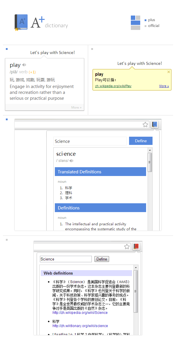
主要的提升有两点, 一点是 UI, 更大气, 简约一点, 视觉细节处理也更到位. 另一点则是英文划词同时显示中英文双语翻译, 中文方便快速浏览, 英文翻译则方便了解细节等等. 先上截图.

Google Dictionary Plus v.s. Google Dictionary

项目页面 github.com/vilic/a-plus-dictionary

已改名 A+ Dictonary 上架 Chrome Web Store!
https://chrome.google.com/webstore/detail/a%20-dictionary/nbdnlnijofenjgknplpelkpmhikpangb

有建议欢迎提, 不过不赞助的话就别想我会花多少时间弄这个了哈哈. 毕竟精力有限~

就没有用 ThinkPad 的同学吐槽两个大小写指示图标同时显示嘛!!!

貌似还是上一台 ThinkPad 的时候就有这个问题了… ThinkPad 本身那个还是比较好看的, 但是!!! Win 7 的情况下为什么还会有第二个那种货色的东西!!! 见截图.

caps lock indicator

所以一定要把它干掉啊!!! 不过表示我一个搞前端的没怎么接触过桌面开发, 也一下子想不起来怎么定位这个文件, 还好有观摩黄冬冬大神调试的经验, 想起来一个叫 Spy++ 神马的工具 (Visual Studio 附带的工具). 于是拿来 Find Window, 然后乱点 (其实原来我也干过不过没找出什么可用信息来), 这次突然发现看得到进程信息, 是个叫 BTTray 的家伙! (其实一开始我以为是 Battery) 原来是个蓝牙的托盘图标应用… 还开机自动启动 (原来都选择了不显示, 但是这东西照样启动)… 结束进程, 删掉开机启动相关项, 切换大小写的时候终于清静了囧…

连接校内 WiFi 后自动连接 VPN 实践一二

自动化万岁~

所以问题是这样的, 部分可能类似于我这种不用 Dr.COM 上网而用各种 VPN 的同学经常希望局势能更乐观美好一些, 比如电脑开机自动连上 WiFi 之后能够顺道把 VPN 什么的也连上. 看似只省了一部操作, 其实省下了在诸多开机自动启动的程序上重新登录之类的操作. 关键是, 爽~

所以这里结合自己的经验介绍两种方法. 因为用的英文系统, 对应的中文名称就凭感觉啦.

1. Task Scheduler

打开 Task Scheduler, 左侧可以看到目录, 随便找一级看着顺眼的右键新建任务.

General 选项卡中填上任务名称, 比如 ConnectVPN, 下方选择 Run w (这个其实我是凭感觉选的, 你们随意, 总之好用).

Trigger 选项卡中新建一个 trigger, Begin the task 选择 On an event, 下面出现的两个下拉菜单和文本框依次选择和填写:

Microsoft-Windows-WLAN-AutoConfig/Operational
WLAN-AutoConfig
8001

确认继续. 然后在 Actions 选项卡中添加一个 Action, 不过在此之前先在电脑上比较宜人的位置新建一个 js 文件 (比如 connect-vpn.js), 内容如下 (其中的中括号是要一起替换掉的, 在进行下一步之前, 你可以先断开 VPN, 双击运行脚本看看能不能成功连上).

var shell = new ActiveXObject("WScript.Shell");
shell.run("rasdial [VPN连接名称] [用户名] [密码]");

那么就在新建的这个 Action 中选择刚刚创建的这个 js 脚本文件, 确认继续.

切换到 Condition 选项卡, 取消连接电源才执行任务的选项. 再往下有个选项可以选择依赖的网络连接, 可以试试, 我没弄过… 因为有更棒 (对我来说) 的方法.

至此基本搞定, 最后还有个 Settings 选项卡大家根据自己胃口设置啦. 确定保存, 会要求输入密码. 现在连接一个 WiFi, 就会自己连 VPN 啦~ 当然, js 脚本还可以做很多事情, 这里只是以 VPN 为例. 或者也可以不用 js, 自己随意~

1.1 Task Scheduler with Custom Trigger

但是只想在连接到某几个无线网络的时候连 VPN 肿么办? 上面提到一个我没试过的方法, 不过不尽完美, 因为换个地方, 即便是同样的 SSID, 可能也没法连了 (我 YY 的, 具体请自己测试)… 加上楼主的 WiFi 源主要有两个, 寝室自搭的 WiFi 和学校的. 这个时候就可以自定义 Trigger 啦.

回到 Trigger 选项卡, 选中刚刚新建的 Trigger 编辑, 类型由 Basic 改为 Custom, 然后 Add Event Filter. 在打开的对话框中切换到 XML 选项卡, 并且勾选 Edit query manually. 会有警告说再也回不去了, 好马不吃回头草~

<QueryList>
    <Query Id="0" Path="Microsoft-Windows-WLAN-AutoConfig/Operational">
        <Select Path="Microsoft-Windows-WLAN-AutoConfig/Operational">*[System[(Level=4 or Level=0) and (EventID=8001)]] and *[EventData[(Data[@Name='SSID']='CQUNET' or Data[@Name='SSID']='VILIC-C1539')]]</Select>
    </Query>
</QueryList>

贴上如上代码, 这里 CQUNET 和 VILIC-C1539 是我常用的两个 WiFi 的 SSID, 请更改为自己的. 里面那个 or 很明显吧~ 如果只需要一个的话就删掉后一个, 还有 Data 前后的圆括号. 如果还想要! 还想要就加!

保存搞定~

2. Intel 网卡驱动自带的功能.

装驱动的时候装一下完整包, 貌似精简包里没这个. 右键已经连上的 WiFi 连接查看属性, 在 Connection 选项卡中看有没有一个叫 Enable Intel connection settings 的选项, 没有就不用继续了 (或者考虑装驱动). 勾选后配置.

然后瞬间发现有一项可以改 MAC 有没有! 原来怎么就没有发现!

不过这里要改的是 Application Auto Launch, 勾选上之后要选中一个程序. 可以是 bat, 可以是 exe 什么的… 但是不能是 js. 于是桑心了. bat 当然还是很好用的, 不过黑框框一闪实在过不了我完美主义这关, 于是 C++ 写个小程序来拨号好了 (C# 可能更方便, 当时脑抽就用 C++ 了).

因为我 C++ 不好, 就不献丑了, 你们这些地球人用 bat 吧.

然后,,, 就没有然后了. 祝大家自动连接愉快~

ThinkPad 蓝牙鼠标偶尔没反应似乎是蓝牙模块的问题

买T430s的时候一起买了个蓝牙小黑鼠, 不过从那个时候开始鼠标就会偶尔在使用中突然没了反应, 需要几次开关蓝牙才能解决, 偶尔运气不好则需要重启电脑. 但是久了就习惯了.

不过前些天蓝牙直接罢工, 一开始我以为重启下就好, 但当时懒得重启于是随便插上了个有线鼠标继续用了几天. 不过当我下定决心重启之后, 发现蓝牙直接从设备管理器中消失了囧. ThinkPad的Radios面板里也看不到蓝牙的开关了. 多次重启无果后猜测是蓝牙模块坏掉了… 不过据说那东西不可能坏…

问了下卖家推荐说是重装系统试试, 笑呵呵,,, 我宁愿把电脑拆个遍也不会重装系统… 太麻烦了. (因为毕竟是被误判到了技术党一类里的人, 电脑里很多工具软件安起来太费神了) 于是, 我选择了把电脑拆个遍… 淘宝入手原装蓝牙4.0模块, 一边看教程一边拆本子. 原来也偶尔会拆本子但不会拆那么深入(主板弄下来了)… 顺道也把风扇清洗了下. 装回去的时候有点小插曲, 因为一颗主板上的螺丝上错, 又在只剩几个的时候才发现有问题, 基本又拆了个通透才搞定…

完成之后开机, 提示设备改动需要重启(可能是因为本子是休眠而不是关机, 蓝牙模块可能也不是即插即用的), 但之后在设备管理器中仍然看不到蓝牙模块,,, 心凉了一大半… 不过打开ThinkPad的Radios面板, 蓝牙开关出现了, 打开, 本子就自动装好驱动. 配对完鼠标后, 一切正常. 使用了小两天之后, 鼠标都没有再出现之前突然瘫痪的情况, 粗略猜测是之前的蓝牙模块一直有问题,,, 只是前几天终于爆发了.

顺便ThinkPad T430s的拆机过程也比较伤心, 网上有拆机的照片, 但是没说步骤, 我也是第一次拆那么多… 简单说下步骤便于需要的同学参考, 中间可能需要自己整理下线, 也请大致记一下各种螺丝的位置.

1. 电池, UltraBay, 还有盖住内存网卡等等的那块板子.
2. 卸下后盖上, 及拆开上面那个板子内所有能看到的螺丝(除了固定网卡/SSD这类的, 不过如果想卸下主板也需要拆). 其中有两颗是固定键盘的, 在本子背部都会有小图片和箭头提示.
3. 卸下硬盘盖子, 电脑正常防止时在左手手掌的位置. 卸下螺丝后抠螺丝在的那一边就可以打开了. 卸下硬盘和可以看到的螺丝.
4. 拆键盘, 这个需要注意, 在拆掉上述所说的固定键盘的螺丝后, 把键盘向上推, 然后先掀开键盘下方, 再取出键盘. 注意排线(我的没有键盘背光灯, 所以只有一根, 估计有键盘背光的会有两根).
5. 拆掉这面能看到的所有跟固定C面(也就是本子键盘那面)的螺丝, 这个时候应该就能取下C面了. 蓝牙模块就在右下角UltraBay下面, 非常小.
6. 如果想继续拆下主板, 需要先拆下显示器. 在本子后侧面有两个正方形的小贴片挡住了螺丝, 用刀背小心撬开, 卸下螺丝即可. 另外还有和主板相连的几块小东西, 需要先卸下. 有一块有一颗螺丝挡在排线下面, 需要掀开排线卸下.

大致就是这样了, 再提醒下一定注意记各种螺丝的位置啊…

附图两张~

WP_20130421_002

WP_20130421_012